
Welcome back to The Forest of Legends, everyone! Today we will talk about something new that we’ve never explored, maps! I love looking at maps, reading about them in atlases, and I even make some too! Today I will show you some of my maps that I have created overtime, and that can even be a good source for any information you might need in school! Now, like always, I don’t feel like yapping for half of this article, so I shall take you on a map journey, starting… now!
Life Expectancy by country
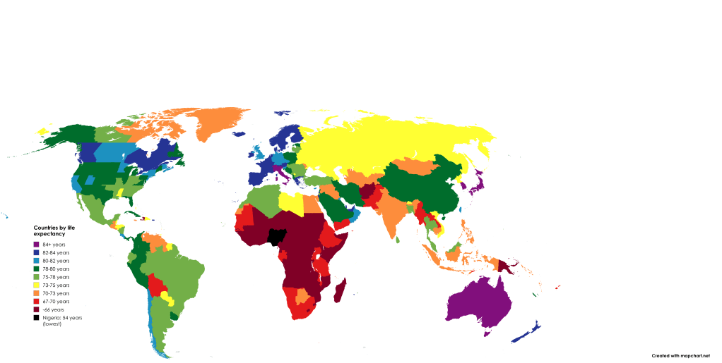
Sorry if the key is so small, but as you can see, you kind of get the idea here. There is Europe and Eastern Asia, which have much higher life expectancies than other places. Even North Korea has a higher life expectancy than Indonesia! Finally, there is the Sub-Saharan Africa belt of Maroon-colored countries. By no means any of these countries are bad, just some of them are less developed than, let’s say Australia! And there are some brighter spots in there too, like Botswana or Gabon!
A way of saying how old these countries are

Basically, I was creating a fun way of saying how old countries are, just by putting them in a “human-life” format. For example, South Sudan falls into the “baby” stage, since it just gained independence in 2011. But Japan falls into the “elderly” stage due to it having been somewhat a sovereign nation for over 1,000 years.
Which state hates which state the most

Now, I’m sure you’ve seen this map before if you are interested in maps like I am. but I just had to put this map on my list for various reasons. First of all, it looks like most of the west has gained up on California (probably because they are jealous). Secondly, it seems like New Jersey hates everyone, which has made 4 other states hate it. And finally, Florida is the only state that hates itself.
One thing odd about this map – when did South Carolina start loathing Ohio?
Thank you, and make sure to like and subscribe!

Leave a comment